Well,
my original idea for my ICFF post was going to the
"The Good the Bad and the Ugly".
But as soon as I pulled close enough to an
"Ugly" booth,
I would be besieged by sweet and eager people
looking to sell their "fabulous" wares.
It was just too much... I felt kind mean, and they were just so nice.
That and the fact that I had to actually talk to them about their
"disaster" made it too much to bare.
SO,
Here are highlights of things I simply liked, or got my attention,
mostly in a good way....
Tom Dixon seemed to be the star of this years show.
He seemed to be everywhere
and this
"lamp factory"
was great.
This is what I should have bought for 150....
GET BACK TO WORK CHILD!!!!
His cubist crystalline enamels were nice too.
A mess of stools.
In the flesh.
Some weirdness in the German booth.
This is by Jonannes Hemann.
He is looking for a producer,
or so the sign said.
It reminded me of Max Lamb.
Detail
Steffen Kehrle Altelier
More Max Lamb memories for some reason.
Nice, in a brutalist way.
VERY German.
Not very German,
yet German.
Kai Linke
"I am ready for my close-up Mr. De Mille"
These things were so
STUPID.
Yet, I had to take a picture,
so they win!
Poor fish.
Nice face for my collection.
Old idea,
but nice execution.
This is the simplest of these designs
I have seen.
I'd much rather have this one though....
I know someone who has two.
Fucker.
Good job
Ufuk Keskin and Efecem Kutuk!
(I'm not even kidding!)
To prove I'm not
Click here.
This woman's silk designs were really great.
This was a sample collage of all her designs.
Nice job,
Morag Macpherson!
I wish this was a joke,
but it's not.
Nice job with the packing tape
Design Stockholm House!
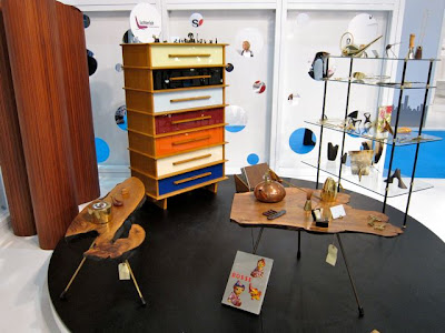
Herman Miller is reissuing some of the
Nelson Case Goods.
Yawn.
I'm yawning again.
Plus, the finish was TERRIBLE.
Come on Herman Miller, get it together.
There were a lot of "demonstrations" going on.
This one at Artek included a Swedish Rockabilly
Upholsterer!
He was great, see him off to the left?
Why an I so chicken to take pictures of people!?
AUBOCK!
New and old in the Austrian Booth.
Nice.
This was in the Yale booth.
I liked it.
One of 2 prototypes.
Nice job person who I can't find the card of...
I mean,
NICE JOB
Timothy Newton
B.A.,B. Arch., M. Architecture
Critic, Yale University School of Architecture.
(That's what his card says, pretty fancy pants!)
I'm not sure why this intrigued me so much but it did.
Good job with your Senior thesis Vanessa Leung!
This was in the Czech booth.
It's by A.M.O.S. Design.
The other side has muti-colored drawers
I'm liking this less as I write about it....
Not sure why this reeled me in either.
I usually hate "blob" furniture.
The booth was tight, with the one chair,
and drawings.
The girls working the booth were enthusiastic and cool.
Whoa!
It's an attention grabber....
The drawings were nice.
Almost trying too hard, but just right.
Nice job
Matthew Hoey!


I'm loving your blog. It's way over my head, but I think get it. Thanks for the challenge.
ReplyDeleteThanks Kevin. Just stick with me, after the midterm, things get way easier. Seriously though, if you have any questions about anything I post, please just ask, I'd be happy to fill you in. Thanks again for looking!
ReplyDeleteclearly, she killed the 700-level felting class.
ReplyDeleteI went yesterday... So much bad and ugly. A little good.
ReplyDeleteI agree. I did get a friend to get me 2 of the Tom Dixon lamps though! I was surprised they weren't sold out like they did in Milan.
ReplyDelete